Jan van Toorn. Critical Practice. Rare
Rick Poynor
010 Publishers. 2008. First edition. 239 pp
Jan van Toorn is one of the most significant and influential Dutch graphic designers to have emerged since the early 1960s. While graphic design often does little more than give unthinking visual form to the status quo, Van Toorn focused on meaning rather than smooth stylistic expression and developed critical alternatives to the usual design world conventions.
His designs persistently call attention to their status as visual contrivances, obliging the viewer to make an effort to process their complexities. Van Toorn wants the public to measure the motives of both the client and the designer who mediates the client's message against their own experiences of the world. He hoped in this way to stimulate a more active and skeptical view of art, communication, media ownership and society. Projects such as Van Toorn's posters and catalogues for the Van Abbemuseum in Eindhoven and his long-running series of calendars for the printing firm Mart.Spruijt are powerful demonstrations of graphic design used as a means of commentary and as a tool of critique. Later, as director of the Jan van Eyck Academy, Van Toorn drew together all the strands of his critical practice into a multi-levelled educational initiative that urged designers to think harder about design's role in shaping contemporary reality.

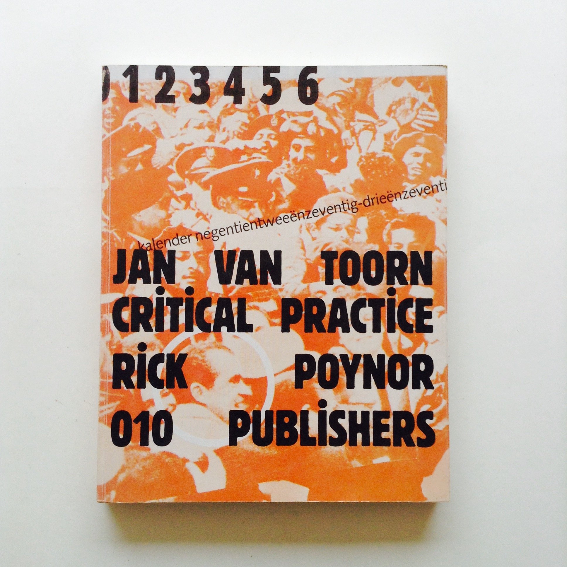 Image 1 of 10
 Image 2 of 10
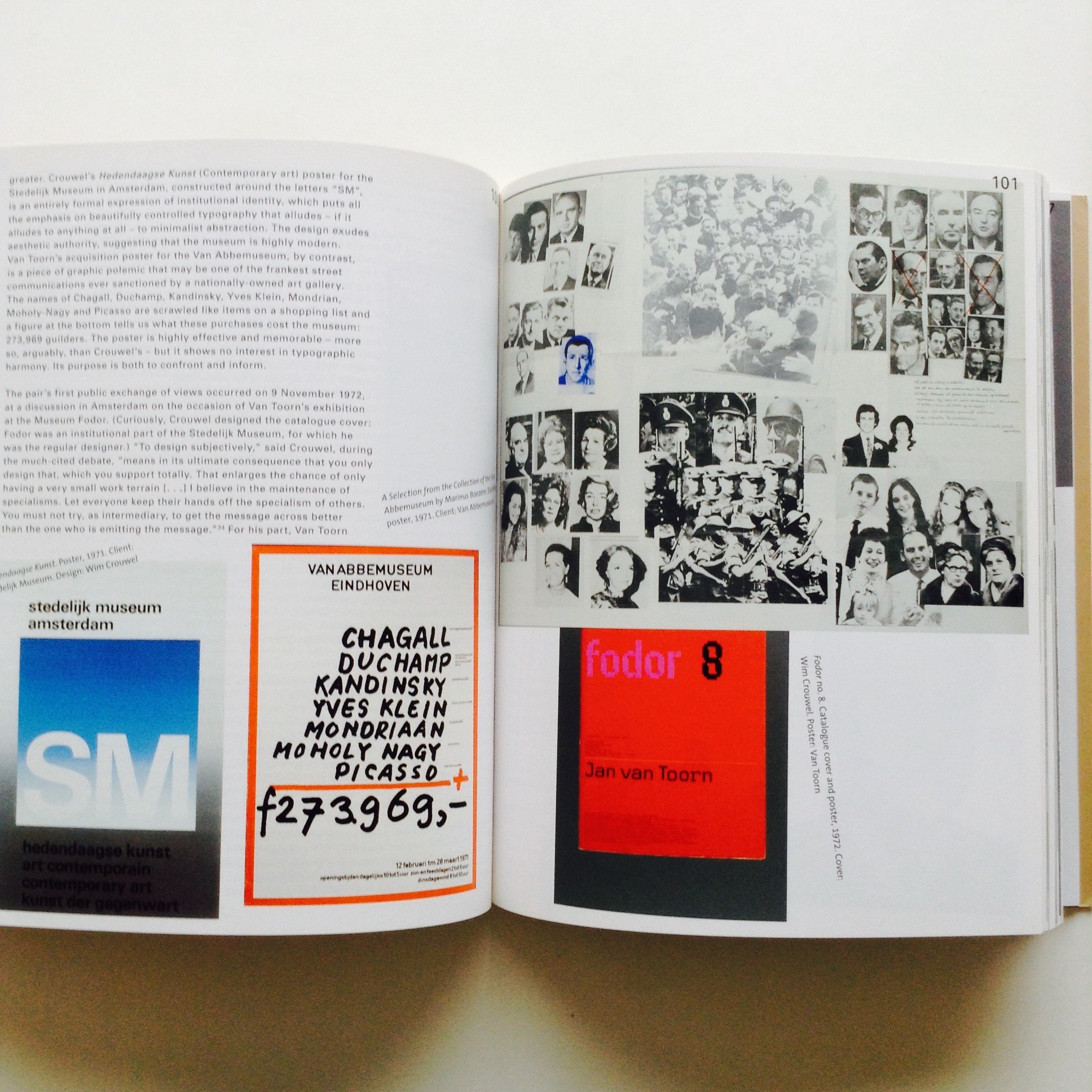 Image 3 of 10
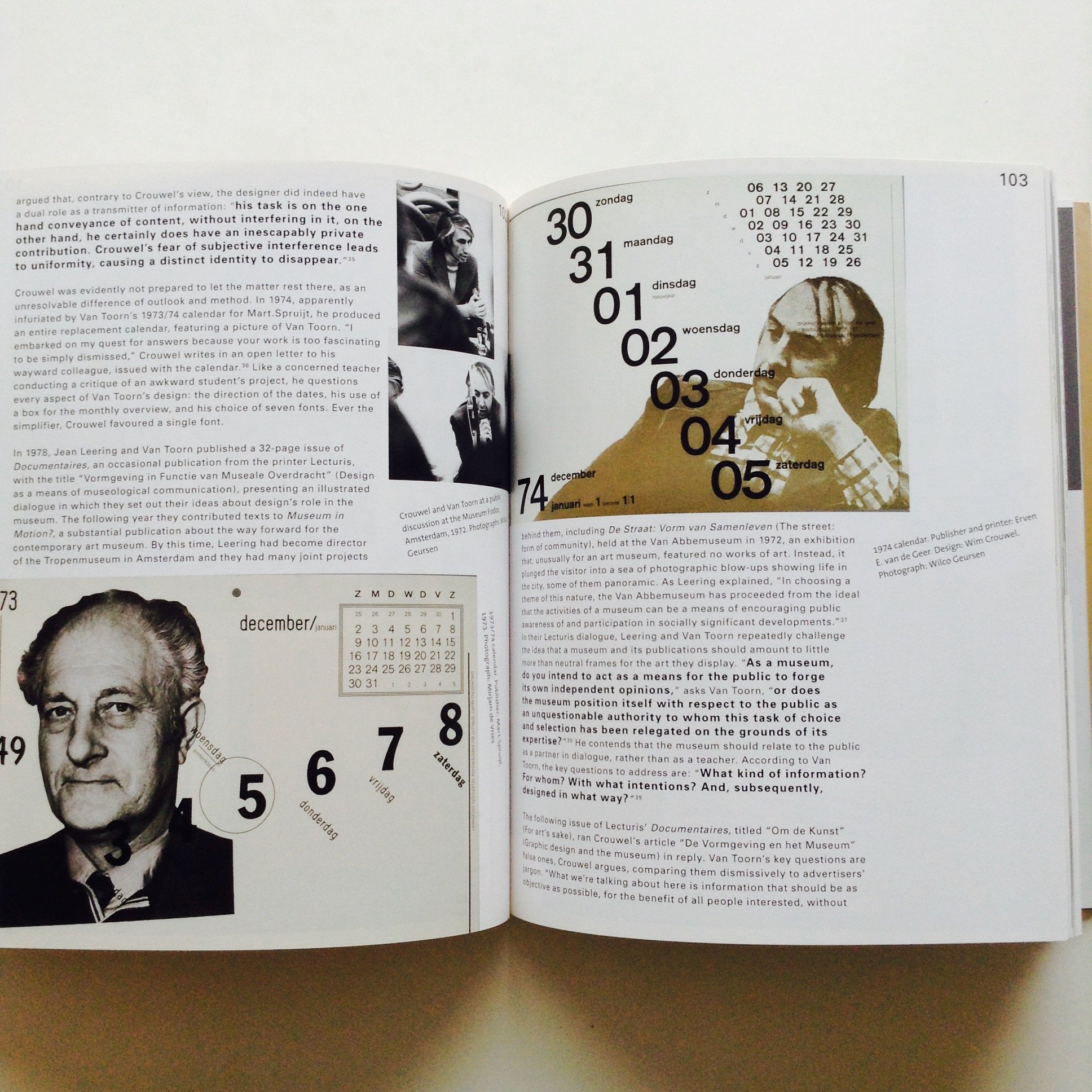 Image 4 of 10
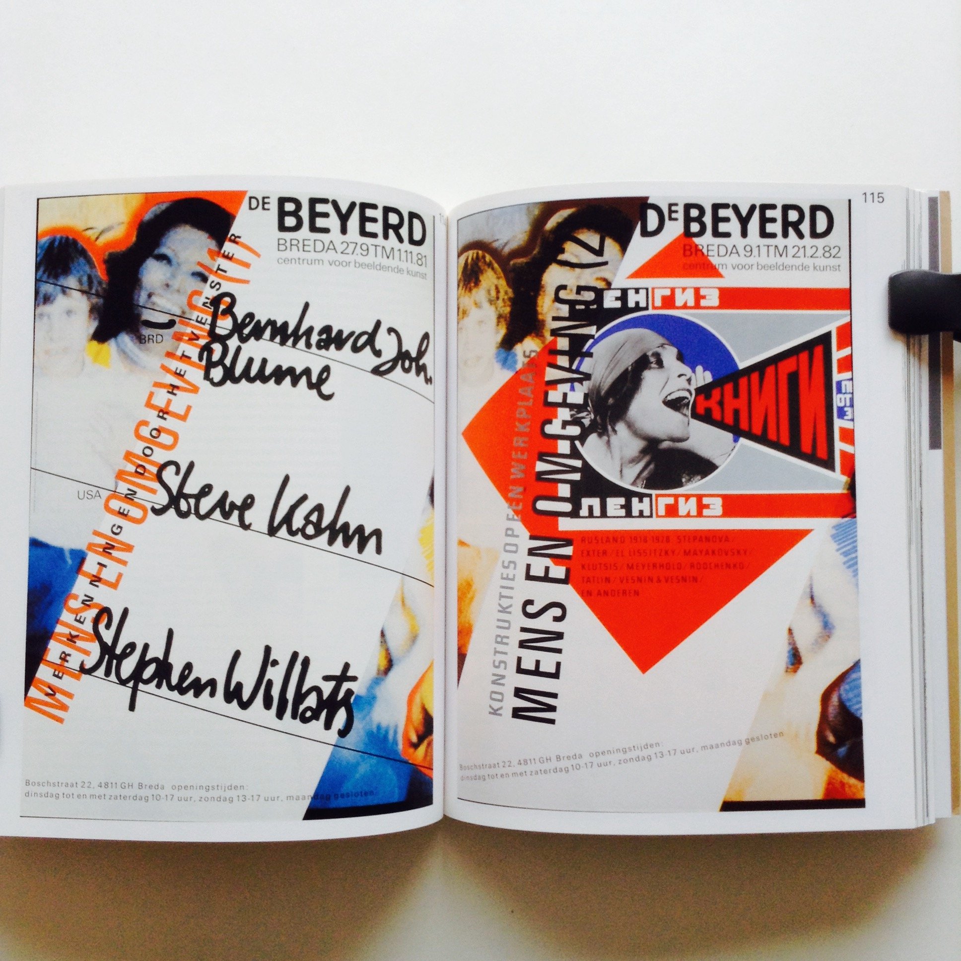 Image 5 of 10
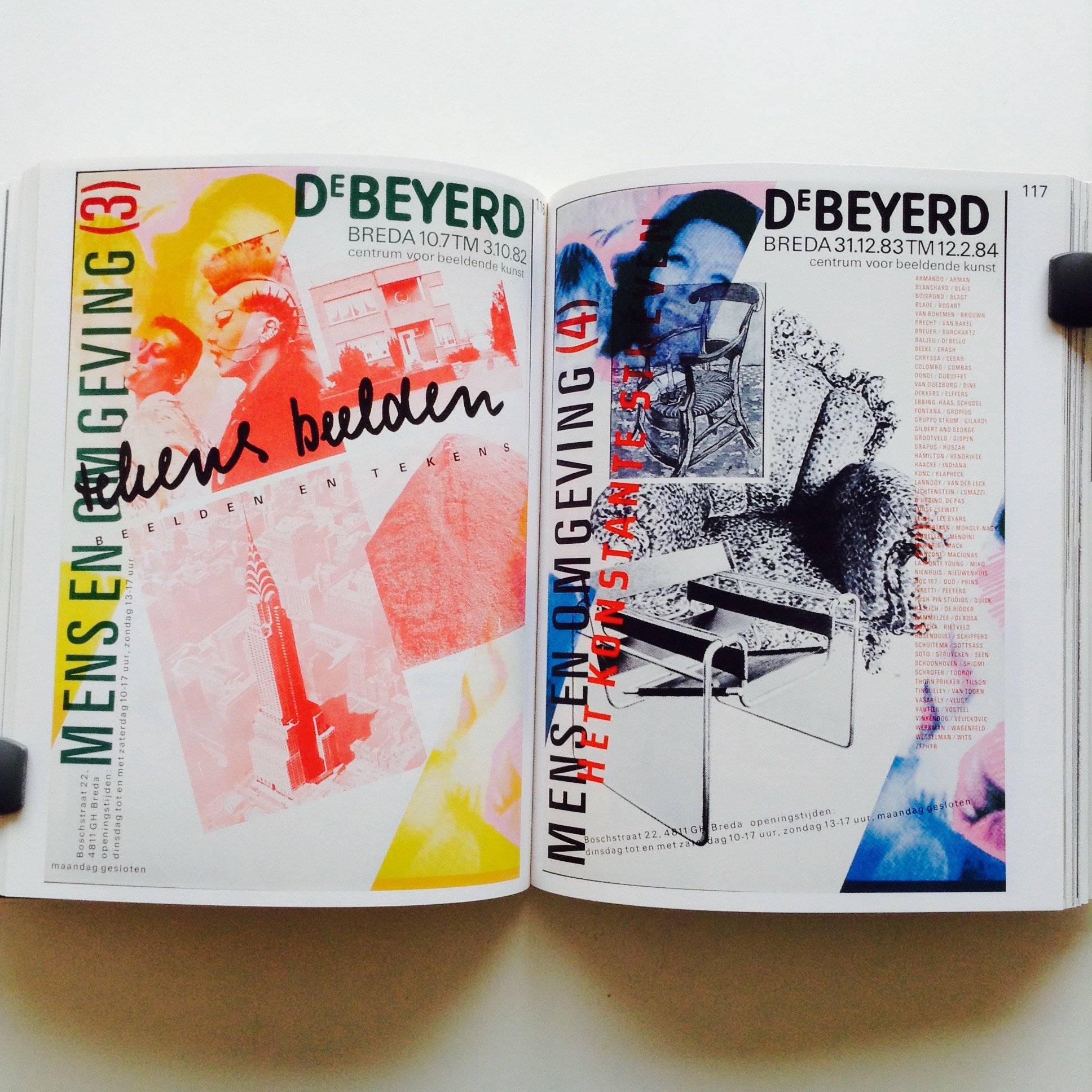 Image 6 of 10
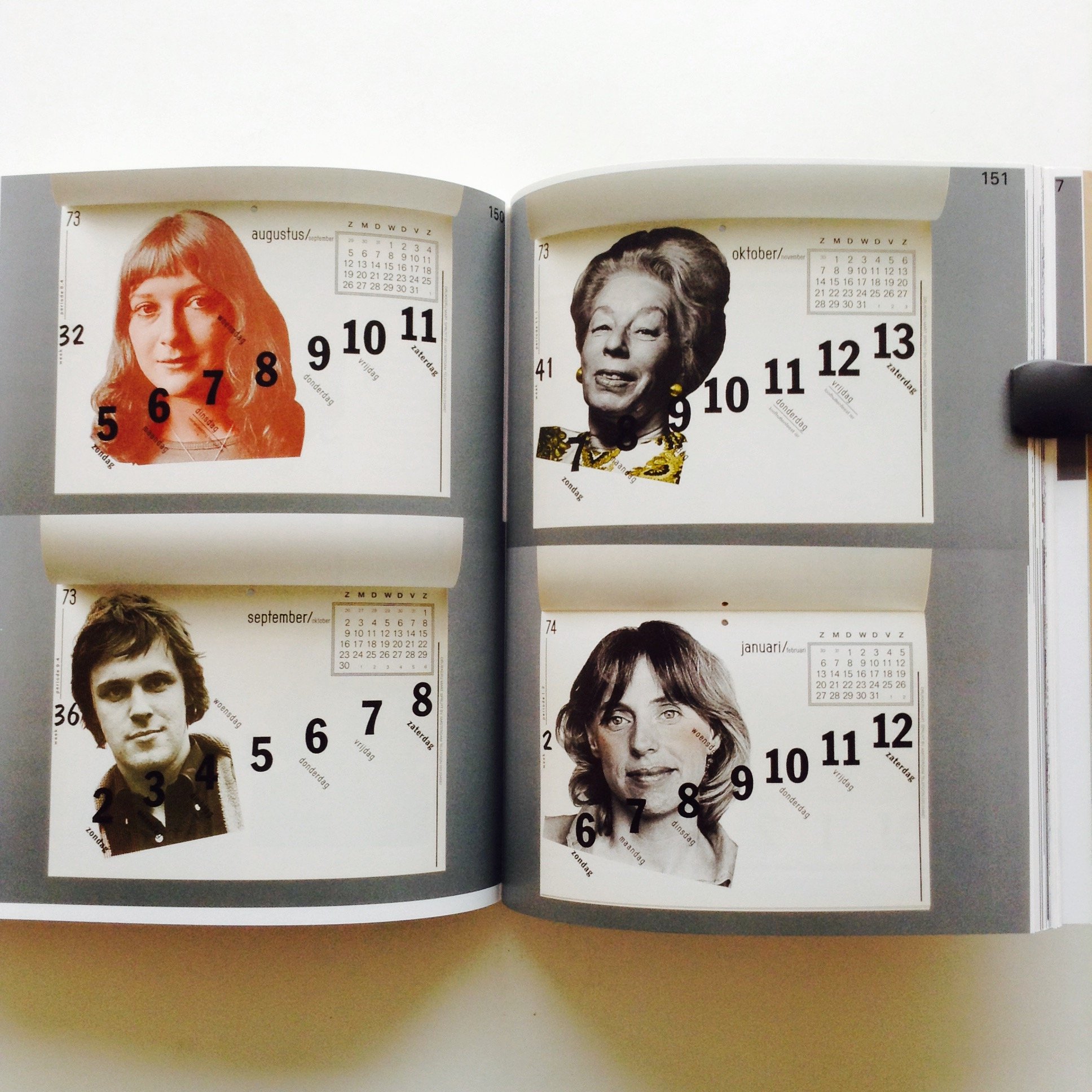 Image 7 of 10
 Image 8 of 10
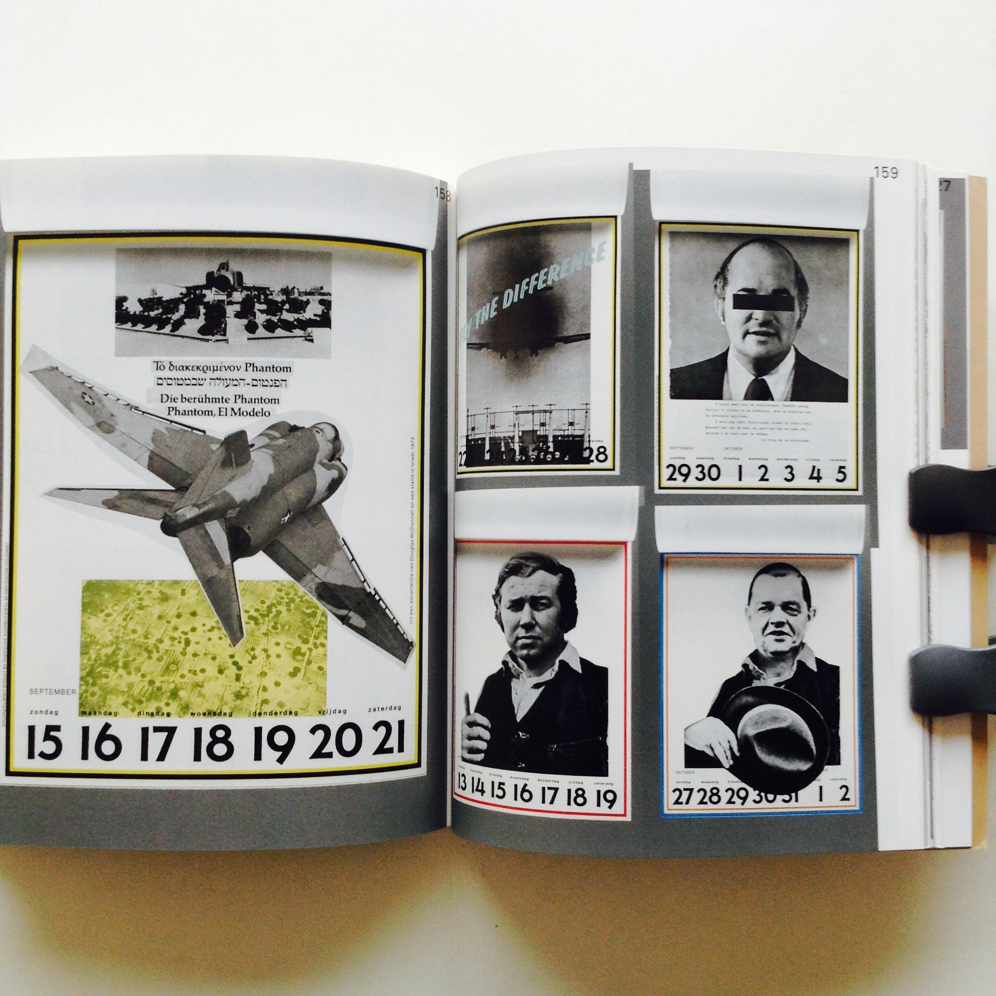 Image 9 of 10
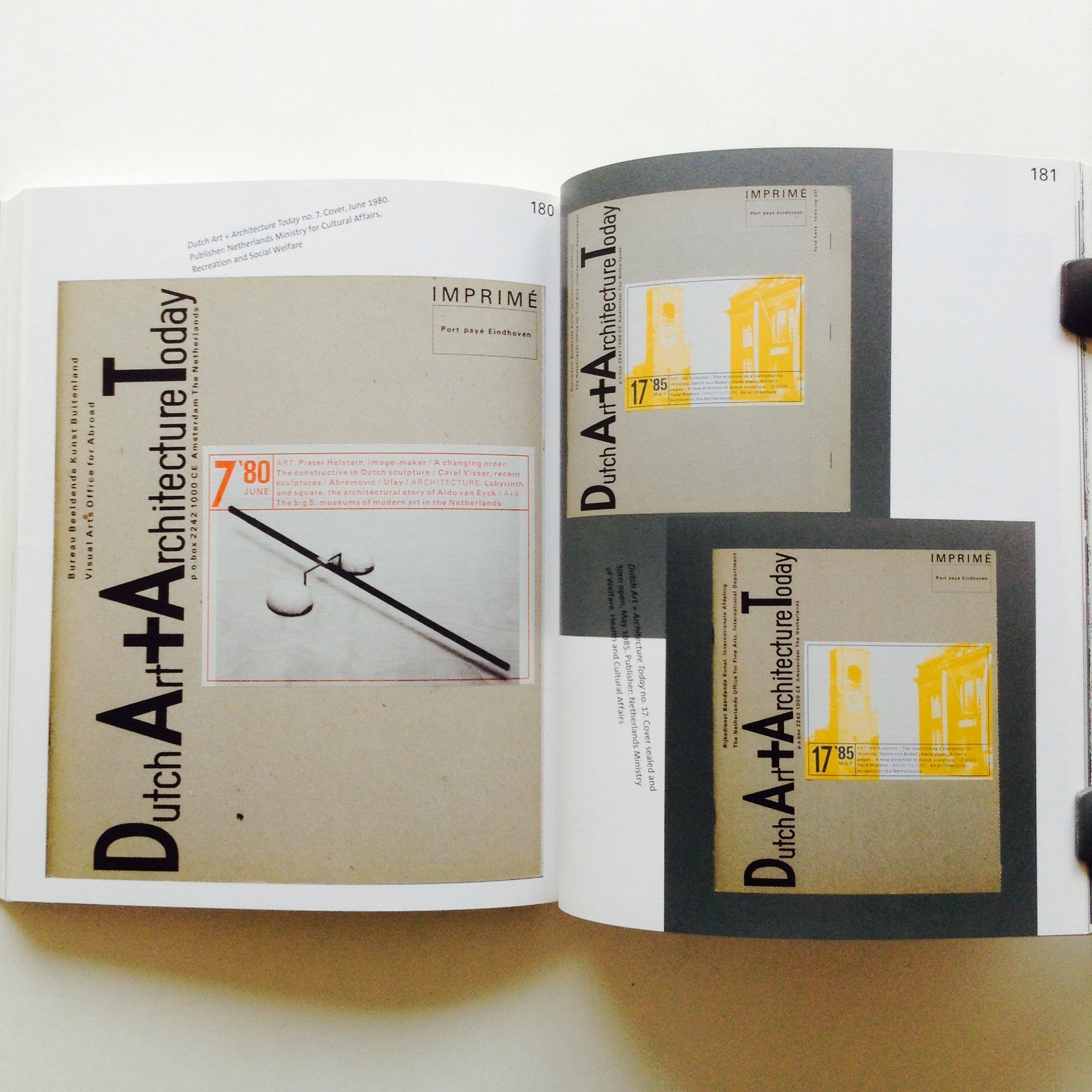 Image 10 of 10